
TL;DR:
- Properly built manager dashboards provide real-time, actionable workforce data to enhance decision-making.
- Key features include live attendance, overtime alerts, shift coverage, and compliance monitoring.
- Avoid clutter and focus on metrics that directly inform weekly decisions for better management outcomes.
Most managers assume a dashboard is just a prettier version of a spreadsheet. You pull it up, scan a few numbers, close it, and move on. But that assumption costs organizations hours of reactive firefighting every week. A manager dashboard, when built and used correctly, does something fundamentally different: it converts raw workforce data into clear signals that tell you what to do next. This article breaks down what a manager dashboard actually is, which features separate good ones from great ones, and how you can use one to make faster, more confident decisions across scheduling, compliance, and team performance.
Table of Contents
- What is a manager dashboard?
- Core features and metrics of effective dashboards
- How dashboards transform workforce management and oversight
- Pitfalls to avoid and tips for maximizing dashboard impact
- Why conventional dashboards can miss the mark and how savvy managers can do better
- Unlock smarter workforce management with Zeppri
- Frequently asked questions
Key Takeaways
| Point | Details |
|---|---|
| Centralized actionable data | A manager dashboard brings key workforce and HR metrics into one unified view. |
| Real-time decision support | Dashboards update live and empower managers to react quickly to workforce trends. |
| Focus on meaningful metrics | Effective dashboards spotlight data that leads to real business actions, not just what's easy to measure. |
| Avoid common pitfalls | Prevent dashboard overload by involving users and connecting data to decisions. |
What is a manager dashboard?
A manager dashboard is a centralized, visual interface that displays your most important workforce metrics in real time. Think of it as the control center for your team. Instead of toggling between spreadsheets, inboxes, and scheduling tools, you get one view that shows attendance, shift coverage, time-off requests, overtime hours, and performance trends at a glance.
The critical distinction from a standard report is interactivity. A report is a snapshot. A dashboard is live. You can filter by department, drill down into an individual employee's hours, or set alerts that notify you the moment someone misses a clock-in. HR dashboards consolidate HR KPIs and workforce records into unified, decision-ready views, which means the data is always current and actionable rather than historical and passive.
Here is what a well-structured manager dashboard typically includes:
- Centralized workforce view: All employee statuses, shift assignments, and attendance in one place
- Visualized KPIs: Charts and color-coded indicators that make patterns immediately obvious
- Customizable filters: Drill down by location, department, role, or date range
- Alert mechanisms: Push notifications for overtime thresholds, missed punches, or policy breaches
- Export options: One-click data pulls for payroll or compliance audits
| Feature | Static report | Manager dashboard |
|---|---|---|
| Data freshness | Historical | Real time |
| Interactivity | None | Full drill-down |
| Alerts | Manual | Automated |
| Decision speed | Slow | Immediate |
| Customization | Limited | High |
"The goal of a dashboard is not to show everything. It is to show the right things at the right moment so a manager can act."
Pro Tip: Before building or configuring your dashboard, list the three decisions you make most often each week. Design the dashboard around those decisions first. Data that does not connect to a clear action should not take up screen space. Exploring mobile app features for managers can also show you how mobile-first dashboards extend this visibility beyond the desk.
Core features and metrics of effective dashboards
Not all dashboards are created equal. The gap between a dashboard that managers love and one they ignore comes down to which metrics it surfaces and how those metrics connect to real decisions.
Modern manager dashboards translate data into actionable insights that inform workforce decisions, rather than simply displaying raw numbers. The five features that consistently deliver the most value for busy managers are:
- Real-time attendance tracking: See who is on site, who is late, and who called out, updated the moment a clock-in or clock-out occurs.
- Overtime and hours alerts: Automated flags when an employee approaches or exceeds their weekly limit, so you catch cost overruns before they appear on payroll.
- Shift coverage visualization: A clear view of which shifts are understaffed or overstaffed across the next 7 to 14 days.
- Compliance monitoring: Alerts tied to labor law rules, such as mandatory rest periods or maximum consecutive days worked.
- Custom report triggers: Scheduled or on-demand exports that connect dashboard data directly to payroll or HR systems.
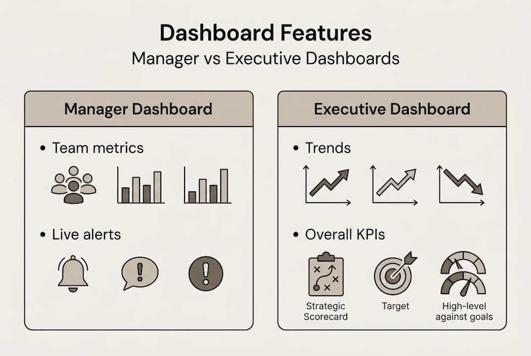
Manager dashboards and executive dashboards serve very different purposes. Executives need broad trend lines. Managers need granular, action-ready data. The comparison below illustrates this clearly:
| Dimension | Manager dashboard | Executive dashboard |
|---|---|---|
| Scope | Team or department | Entire organization |
| Granularity | Individual shifts, punches | Aggregate trends |
| Update frequency | Real time | Daily or weekly |
| Primary use | Immediate action | Strategic planning |
| Key metrics | Attendance, overtime, coverage | Turnover rate, labor cost % |
One insight that surprises many teams: dashboards that focus only on easy-to-measure data can miss meaningful business outcomes entirely. Tracking clock-in rates is easy. Tracking whether shift coverage actually meets customer demand requires a slightly more deliberate setup, but it is far more valuable.
Pro Tip: Avoid dashboard clutter by applying a simple rule. If a metric does not trigger a specific action when it changes, remove it. Every visible data point should earn its place. Reviewing must-have dashboard features and understanding mobile workforce engagement strategies can help you prioritize what actually moves the needle for your team.
How dashboards transform workforce management and oversight
Understanding dashboard features is one thing. Seeing how they reshape the daily rhythm of workforce management is where the real value becomes obvious.

Consider shift planning. Without a dashboard, a manager typically checks a spreadsheet, cross-references time-off requests, calls a supervisor, and still ends up with a gap on Friday afternoon. With a live dashboard, shift coverage issues surface automatically, days in advance. You see the gap, drag in a replacement, and the employee gets notified on their phone within seconds. The benefits of centralized scheduling compound quickly: fewer last-minute scrambles, lower overtime costs, and better employee satisfaction.
Here are the scenarios where a manager dashboard adds the most immediate value:
- Absenteeism trends: Spot employees with recurring Monday absences before it becomes a disciplinary issue
- Overtime creep: Catch hours accumulating mid-week before they inflate your labor costs
- Compliance breaches: Get alerted when a team member is scheduled for a seventh consecutive day
- Missed punches: Identify clock-out failures before they create payroll discrepancies
- Coverage shortfalls: See understaffed shifts in real time and fill them before the day starts
Dashboards convert complex workforce data into actionable oversight, decision triggers, and proactive management rather than reactive cleanup.
"A dashboard should feel like a co-pilot, not a logbook. It should tell you what is coming, not just what already happened."
Take absenteeism as a concrete example. A manager reviewing weekly reports might notice high absence rates after the fact. A dashboard user sees the pattern forming in real time and can intervene early, whether that means a conversation with an employee or adjusting scheduling expectations. Pairing this visibility with strong workforce compliance strategies means you are not just reacting faster but preventing problems from forming in the first place.
Pitfalls to avoid and tips for maximizing dashboard impact
Even well-intentioned dashboard setups can fail. The most common reason is not a technology problem. It is a design problem rooted in how the dashboard was built and for whom.
Dashboards often fail when designed around data availability instead of real decision-making needs. If your system can easily report headcount but struggles to show shift coverage by role, a poorly designed dashboard will show you headcount because it is convenient, not because it is useful.
The three most damaging pitfalls are:
1. Information overload. Showing every available metric creates visual noise. Managers stop looking because nothing stands out. Keep the primary view to six to eight metrics maximum.
2. Tracking vanity metrics. Total clock-ins logged or average hours per week look impressive in a meeting but rarely drive a management decision. Replace them with metrics tied directly to cost, coverage, or compliance.
3. Skipping workflow integration. A dashboard that lives in isolation from your scheduling or payroll tools forces managers to double-enter data or manually act on insights. The dashboard should trigger actions, not just display information.
To build a dashboard that actually drives results, follow these steps:
- Identify the top five decisions your managers make each week
- Map each decision to the specific data it requires
- Configure alerts that fire when those data points cross key thresholds
- Involve frontline managers and HR in the layout design, not just IT
- Review and prune dashboard content every quarter as business goals shift
- Test with real users before full rollout and adjust based on their feedback
Pro Tip: Run a 30-day audit after launch. Track which dashboard sections managers actually use and which ones they skip. Delete or relocate anything with low engagement. A leaner dashboard is almost always a more powerful one. Applying these principles connects directly to broader workforce efficiency improvements that extend well beyond the tool itself.
"The best dashboard is the one your managers check every morning without being asked. If they are not checking it, the design needs to change, not the managers."
Why conventional dashboards can miss the mark and how savvy managers can do better
Here is an uncomfortable truth most dashboard vendors will not tell you: the majority of workforce dashboards are built around what is easy to display, not what actually helps a manager lead. The result is a visually impressive tool that collects dust within three months of launch.
The real issue is translation. Data visualization is a solved problem. Business translation is not. Knowing that overtime spiked 14% last week is interesting. Knowing which team, which shift pattern, and which scheduling decision caused it is what enables action. As one sharp critique points out, dashboards need business translation, not just visualization.
The managers who get the most from their dashboards treat them as living tools. They update the metrics they track as their team's goals evolve. They ask "what would make me act differently today?" rather than "what can we show?". Pairing this mindset with automated time tracking removes the manual data burden entirely, so the dashboard reflects reality without anyone having to manually update it. One small reconfiguration, such as replacing a generic hours-worked chart with a shift-coverage-by-role view, can immediately surface problems that were previously invisible.
Unlock smarter workforce management with Zeppri
If this article has clarified what a manager dashboard should do, the next logical question is whether your current tools actually deliver it. Zeppri's workforce management platform was built with exactly these challenges in mind.
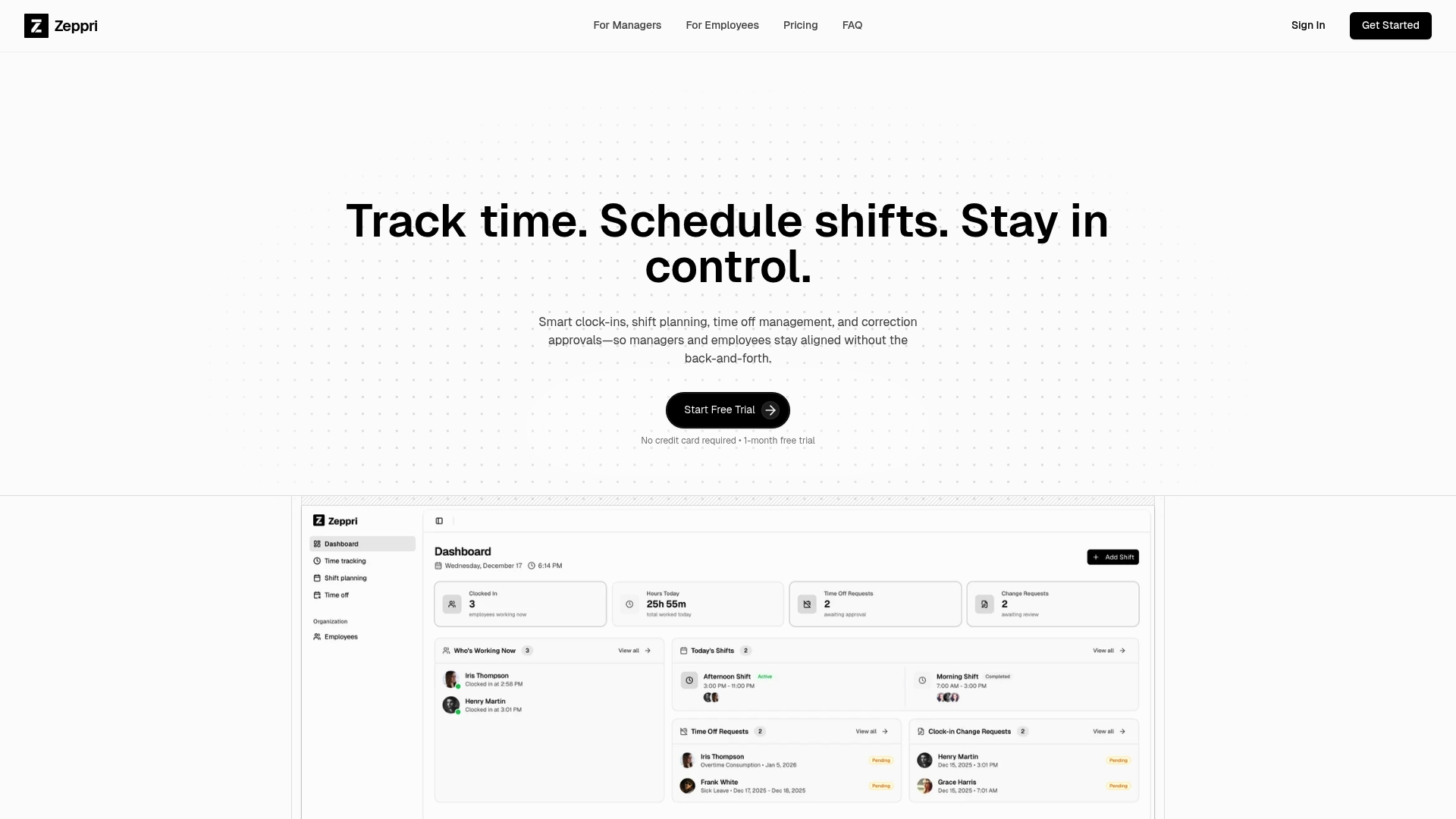
Zeppri gives managers and HR professionals a real-time dashboard that connects scheduling, attendance, time tracking, and compliance in one intuitive view. From automated overtime alerts to geofenced clock-ins, every feature is designed to trigger action, not just display data. Whether you manage a retail floor, a healthcare unit, or a distributed field team, workforce management with Zeppri translates the principles in this article into daily operational wins. Explore the full manager dashboard solution and see how your team can gain clarity, save time, and reduce costly scheduling errors starting today.
Frequently asked questions
What is the main function of a manager dashboard?
A manager dashboard centralizes key workforce metrics, scheduling, and performance data to help managers make rapid, informed decisions. Manager dashboards unify HR KPIs and workforce records into a single, always-current view.
How does a manager dashboard differ from a simple HR report?
Unlike static reports, manager dashboards update in real time, are interactive, and often provide instant alerts and drill-down options for quick action. Dashboards provide live data that empowers immediate responses rather than after-the-fact analysis.
What are examples of metrics to track in a manager dashboard?
Common metrics include attendance, overtime, productivity trends, shift coverage, and compliance alerts. These are typical HR KPIs featured in manager dashboards across most industries.
What is a common pitfall when creating dashboards?
A major pitfall is focusing on easily available data instead of the metrics that actually inform business decisions. Dashboards that visualize easy-to-measure data rather than decision-critical metrics consistently underperform in real-world use.